With CMS 5.0, modernizing the user interface (UI) and improving the user experience was a top priority. The UI pre-5.0 was effective, however CSS has grown as a company and product since, and our UI now reflects our growth in this recent release. As a developer at CSS, I had the responsibility to design the new UI for CMS 5.0, and I am excited to share all the benefits the new UI will bring to our clients.
Consistent
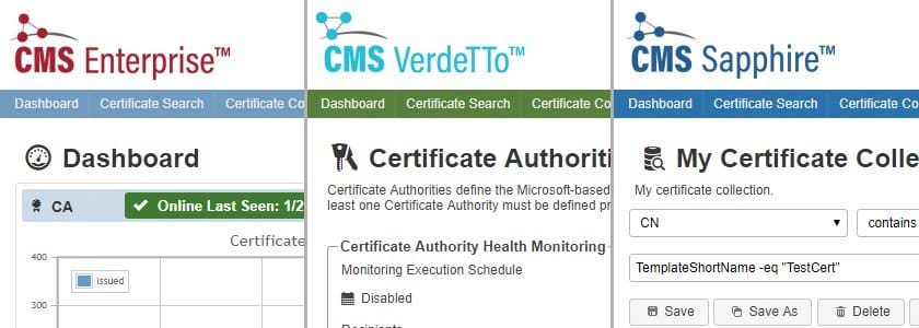
A big strength of our new user interface is the consistency of style across the full CMS Solution Suite. Whether CMS Enterprise, CMS Sapphire or CMS VerdeTTo, our web products feature the same layout and control styling, with product specific coloring.

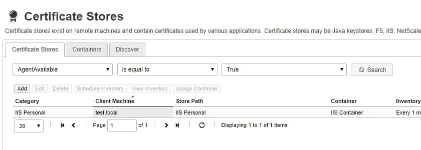
Beyond the consistency throughout the CSS Solution Suite, we invested time into making each piece of the product uniform on a smaller scale. Menus, tables, and fields should reflect the same look and feel throughout every part of the suite, which greatly improves usability. In addition, buttons and icons should signal similar functionality between pages, and you should intuitively be able to understand features that may be new to you just based on their presentation.
Efficient
The development goal in the new IU design was to create a look that just worked better. CMS 4.5 was effective as a management tool, but it was at times complicated to traverse. CSS does not claim to adhere to the design rule of the ‘Three Click Rule’ which is commonly talked in the UI space , a rule that in my design experience is a myth and not completely practical in the enterprise. Overall, you will find the UI more efficient to navigate.

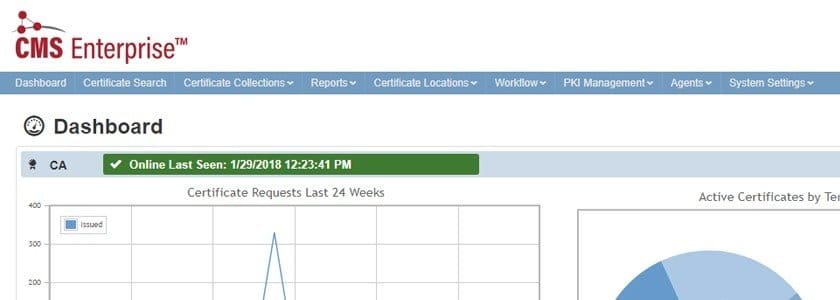
In addition to the efficiency of using CMS, I want to take a moment to highlight our shift to a horizontal navigation. We transitioned from a vertical layout to improve our efficiency of browser space. Many pages in CMS are data-heavy and use tables that display much better with horizontal space to grow.
In addition to the improvement of efficiency, let us take time to highlight our shift from a vertical to a horizontal navigation. We transitioned from a vertical layout to improve our efficiency of browser space. Pages in CMS tend to be data-heavy and use tables that display much better with horizontal space to grow and expand.
Familiar
The popular front runners in UI in the tech space influenced much of the work that we did with the design in an effort to strengthen the accessibility of the products. Taking design cues from Google — Bootstrap in particular, Amazon, and even Stack Overflow, the goal was to make using CMS more approachable to the new user.

You will notice that we have switched to Glyphicons, used in Bootstrap, and the layout and menu are similar to Amazon or Stack Overflow. This leads to a much more polished and familiar user experience.
As you can imagine, multiple UI mockups, ideas, and sketches created can be found in the waste bin over the past 6 months. As a result, the new UI design of CMS 5.0 is the product of many colleagues’ feedback and effort both inside and outside of the development team. The process of redesigning the products was a challenge for me that I enjoyed tackling and I hope you, our clients, enjoy the fruits of our labor.


